“Let’s go for a dark theme, our app will look cool and trendy” — I have come across that statement quite a few times. When I get asked for that requirement, my response contains even more questions. My curiosity rises as I try to figure out the reasoning behind it.
More often than not, the decision is based on personal preferences and assumptions rather than solid data. In my eyes, that does not have a valid standing to proceed with, unless some sort of research and statistics are revealed to back it up.
In the process, I have discovered the following, which could be used as guidance when discussions about dark and light themes arise.
Balanced Contrast for Readability
High color contrast is useful for readability. Too high of color contrast, however, creates a significant disparity in light levels that affect the user’s eyes when they read. A balance of contrast between the text and the background color is an effective way to ensure your text is safe for the user’s eyes.
If you’re unsure about your color contrast, you can use a color contrast checker to find an optimal range that works for you. It shows you when your color contrast is too low based on the WCAG 2.0 industry standards. However, it doesn’t indicate when your color contrast is too high. That decision is left for the designer’s careful eye to decide.
Match the user’s environment
As we’ve already learned, bright light at night or in a dark environment is not the best option for our eyes. Hence, we have to take into consideration the user’s environment when an app is used. The reason behind the dark theme on entertainment platforms, such as Steam, Spotify, YouTube and Netflix, is that users tend to engage in such activities later in the day, after work, or in a room with dimmed lights.
The emphasis is shifted to the main content, in this case, a game or a movie, and the background offers less distractions. Users can immerse themselves in the activity and enjoy vivid colors on a whole new level. It helps users avoid having to adjust their vision between a bright screen and a darker environment, which can lead to strained eyes. The latter also applies to the “night mode” feature on Google maps; the app adjusts its glaring white display to a darker one. (source) (source)
Dark and light themes are also used for the Shoflo team’s event production software. They backed their decision based on the user’s environment as well. A light theme can be used during meetings in the office or other bright environments and a dark theme during a show with limited lighting.
Pure Black Text on White Backgrounds
Pure black text on white backgrounds can cause eye strain when users read the text over an extended period. White has 100% color brightness, and black has 0% color brightness. Such a disparity in color brightness creates intense light levels that overstimulate the eyes when reading text. This causes their eyes to work harder to adapt to the brightness.
A research study has found that "black text on a white background overstimulates the OFF ganglion cells while white text on a black background overstimulates the ON ganglion cells". The study concludes that “the striking effects of contrast polarity suggest that it may not be advisable to read black text on white background.”
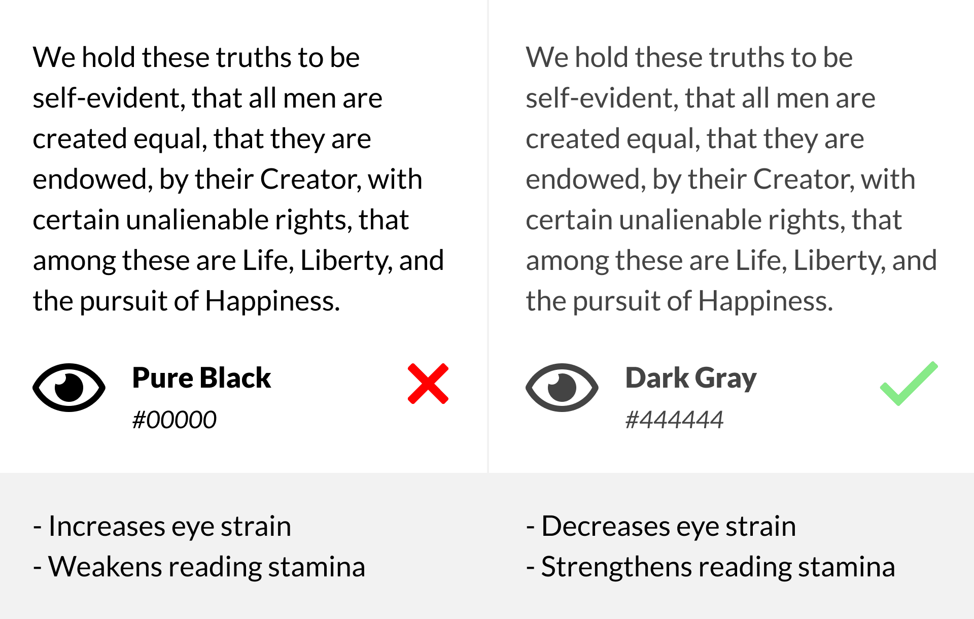
An example that illustrates this concept is when we turn on a bright light in a dark room. Such a drastic change in light conditions is harsh to our eyes. But if we turn on a dim light in a dark room, our eyes adapt to the change more easily because our retina isn’t overstimulated by such a sharp increase in contrast.
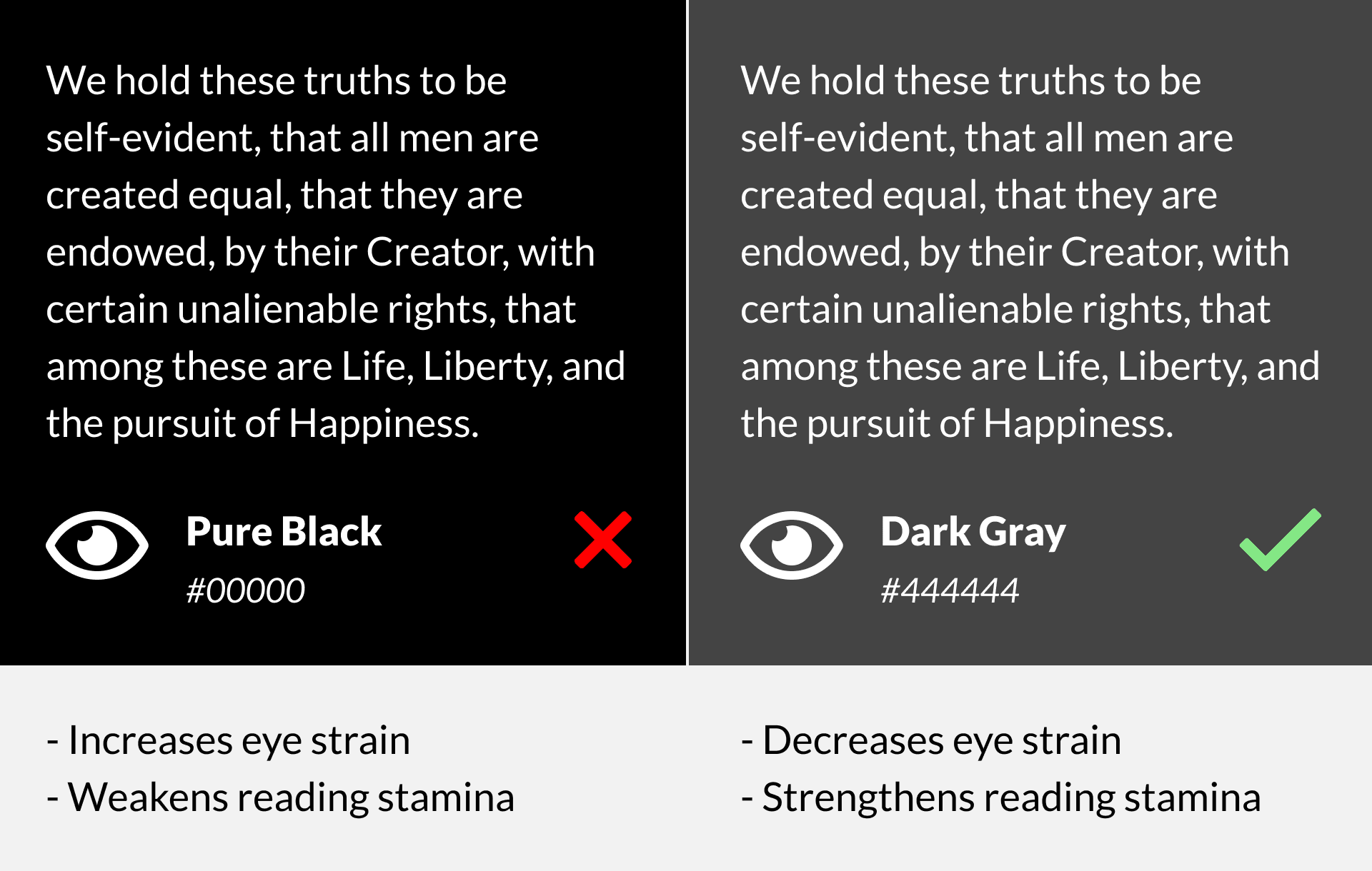
Pure White Text on Black Backgrounds
It would also help to avoid pure white text on a black background. This combination has been known to cause halation in users with astigmatism, and visual distortions in users with contrast sensitivity. Instead of black, use dark gray text on a white background, so the change in brightness will not be as drastic. This prevents overstimulating the retina and allows users to be able to read for a more extended period.
The Verdict
Designing UI is creative. Let’s not rules bind it. But an awesome design should also help boost the user experience and achieve business objectives. It should help your users achieve their goal comfortably and quickly. So think about these considerations and find answers to the questions before choosing between a dark and light UI.
A light UI may seem like a safe bet always, but in some cases, a dark UI can be the winner. So choose wisely.
Did you find this article useful? Share it with a friend!
Sources:
https://uxdesign.cc/dark-or-light-ui-the-ux-influence-ca6df6aff390
https://medium.com/@CanvasFlip/dark-ui-vs-light-ui-how-to-make-the-right-choice-5ddde9baabdb Cover photo by Daniel Korpai on Unsplash