Some might think these cancel one other out, but in reality, there is no absolute answer to this. The closest we can get to an absolute answer is to say that context is what dictates it.
That being said, it’s important to understand the context of your application.
From an uxmovement.com article:
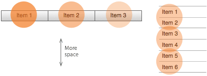
Top Menu has:
- 3 visual fixations, 3 items scanned;
- More vertical space to use dropdown menus;
- Leftmost items carry more visual weight;
- All items are above the fold.
Side Menu has:
- 3 visual fixations, 6 items scanned;
- Less vertical space;
- All items carry equal weight;
- Some items can be below the fold.
Let’s talk about Top Menu:
Top Menu can be a bit hard to scan since it has to be scanned horizontally, which will impact menu items priority. Menu items within the Top Menu will have different weight. The leftmost item will have a bigger weight than all the other on the right side of it.
On the other hand, on the Top Menu layout, menu items are more visible and easier to find, as they are always above the fold. They become even easier to find since they carry two subordinate objects: the header and the logo.
It also leaves you with more space to work with.
Let me give you an example:
A remodelling company might feel they need a page named “Our Services.” This page would have information about the different services they provide, such as flooring, furniture and gardening.
They could easily place a link called “Our Services” in their navigation which links to this page. However, for the user, it would make it easier to eliminate the “Our Services” link and make the services the actual links. This allows visitors to immediately see the services offered.
That said, if you have a small specific/fixed number of categories that you want the user to be focused on and some items are more important than others, Top Menu is the right choice.
There is even an SEO advantage because the link text used on the menu items could be keywords the company may be trying to rank for.
And now, the Side Menu:
The major problem with Side Menu is that items are not always above the fold because sometimes if you have too many items, some of them can get pushed below the fold. Not having all the menu items visible can be a problem for the user. On the other hand, the Side Menu can be faster to scan visually because it facilitates a more natural scanning direction.
Side Menu balances priority the best because, if all the items are above the fold, they all carry the same left-to-right weight.
Let’s dive into another example:
Imagine a clothing store. This site can have products that go from jackets, sweaters, shoes, jeans, socks to watches and much more. The list of product categories can easily grow.
The number of links may get to a point where visually and usability wise, a Top Menu structure would just not work. It would look too much and overwhelming to any user.
If you cannot find an efficient way to group items, Side Menu containing different topics would be best for your users, leaving them to decide which items in the navigation are most important.
Side menus adapt faster to small screen sizes. Although Top Menus can be responsive, they usually require some transformation from Top to Side Menu. Since Side Menus are already in this format, the transition from desktop to mobile is less confusing.
Both styles offer something a little unexpected and both work well in their respective environments. The main challenge is to understand the context of your application. After figuring out the context, it will be easier to choose the best type of menu for your application.
With our Rocket UI you can adapt and choose the type of menu you want!
Cover photo by Carlos Muza on Unsplash