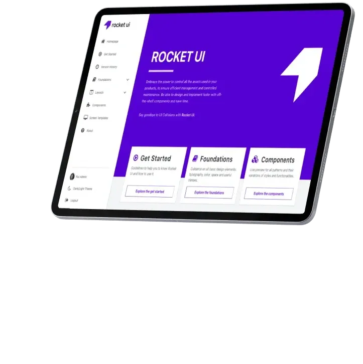
Take full advantage of Rocket UI templates and boost your app
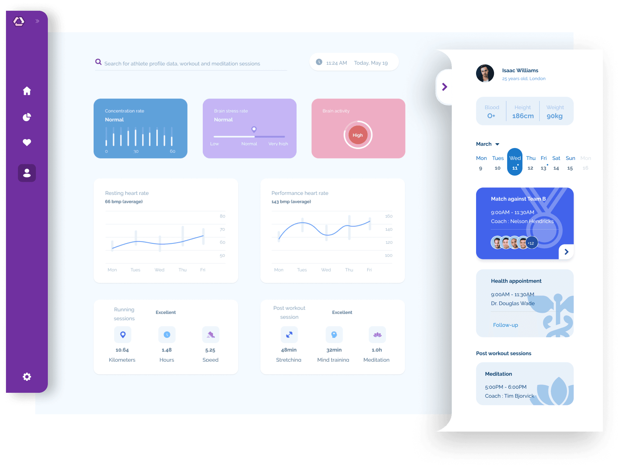
Rocket UI offers a robust collection of advanced UI components, crafted to speed up your development workflow. Utilize our comprehensive library to efficiently build and customize your design system, ensuring rapid deployment of new features with a consistent, production-ready framework.
Improve the developers autonomy
Promote Front-End best practices
Improved application end-quality
Reduce complexity and maintenance costs
Increase developers velocity on building pages


Take full advantage of Rocket UI templates and boost your app
Documented Style Guide
Version History
Curated OpenSource Components
Figma Project
Dark Theme
Documented Style Guide
Version History
Curated OpenSource Components
Figma Project
Pro Components
Pro Layouts
Pro Screen Templates
Dark Theme
Theme Configurator
Custom Front-End Architecture
SCSS Project
Front-End Customisation Service
Dedicated Support

Configure your theme in minutes
Choose a Theme
Custom Styles aligned with your brand needs
The right toll to create your Design System
Unlock the Full Potential of Rocket UI: Connect with Us Today!